

グラフを説明するため流れ
グラフを説明する際には、次のような流れで説明するとスムーズです。
- 概要を述べる
- 軸に触れる
- 全体的な傾向を説明する
- データを比較する
- 極端な数字を強調する
- 要約する、または結論を導く
今回は、前半の❶から❸までのフレーズを紹介します。
グラフを説明するための具体的なフレーズ
下のグラフを説明する中級者向け英語フレーズを紹介します。
graph と chart の違いは?
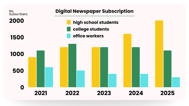
This chart illustrates digital newspaper subscribers.
chart はグラフ、円グラフ、棒グラフ、フローチャートなど、さまざまな種類を含む広い用語です。
This graph illustrates digital newspaper subscribers.
graph は折れ線グラフ、棒グラフなど、座標系を使って変数間の関係を示します。
すべてのグラフはチャートですが、すべてのチャートがグラフというわけではありません。
概要を述べる
This chart illustrates …
読み手や聞き手が、グラフが何を表しているかを素早く理解できるように、最初に述べる文です。
This chart illustrates …
このチャートは …示している。
レポートやプレゼンテーションなど、視覚的なデータを明確にする必要がある場面で、グラフなどの情報を紹介したり説明したりする際によく使われます。
illustrate の後、グラフについて一言で説明を加えますが、他動詞のため、通常、名詞か名詞句を続ける必要があります。
【例】
・This chart illustrates the monthly sales figures …(月次売上高)
・This chart illustrates the comparison of sales performance …(販売実績の比較)
・This chart illustrates the change in product sales …(商品の売上推移)
This chart shows …
This chart shows digital newspaper subscribers.
show を使うと、より中立的でわかりやすい表現で、カジュアルな説明やより一般的な目的の記述となります。
illustrate は、よりフォーマルで分析的な響きを持つ傾向があり、データや洞察を説明する際によく使われます。
This chart illustrates the relationship between A and B.
一言で表現するのが難しい場合は、2つの項目を挙げることができます。
This chart illustrates the relationship between A and B.
このチャートは[AとB]の関係を示している。
2つの変数を比較するために、グラフの項目やタイトルから言葉を抜き出しましょう。
【例】
・This chart illustrates the relationship between internet usage and age group.(インターネット利用と年齢層)
・This chart illustrates the relationship between smartphone ownership and age group.(スマートフォン所有率と年齢層)
・This chart illustrates the relationship between study time and exam scores.(勉強時間と試験の点数)
This chart illustrates … + from … to … / over… / across …
This chart illustrates … from [a certain period] to [a certain period].
This chart illustrates … over [a period of time].
This chart illustrates … across [different categories].
このチャートは[ある期間/さまざまなカテゴリー]における…を示している。
時間とともにどのように変化するか、カテゴリー間でどのように異なるかを延べるために、グラフにある期間やカテゴリーなどを入れてください。
【例】
・This chart illustrates digital newspaper subscribers from 2021 to 2025.(2021年から2025年まで)
・This chart illustrates digital newspaper subscribers over a six-month period.(6ヶ月間の)
・This chart illustrates digital newspaper subscribers across different regions.(さまざまな地域における)
This chart illustrates the relationship between digital newspaper subscriptions and age groups from 2021 to 2025.
このグラフは、2021年から2025年までのデジタル新聞購読数と年齢層の関係を示している。
より洗練された、あるいはアカデミックなバージョンは次のようになります。
The chart depicts how digital newspaper subscriptions varied across age groups between 2021 and 2025.
このグラフは、2021年から2025年にかけて、デジタル新聞の購読者数が年齢層によってどのように変化するかを表したものである。
軸について
vertical axis と horizontal axis を使って縦軸と横軸の数値を説明します。
The vertical axis represents …, while the horizontal axis indicates ~.
縦軸は…を表し、横軸は~を表している。
ユーザー数、カテゴリー、期間など、グラフに記載された項目を盛り込みます。
The vertical axis shows the number of subscribers, while the horizontal axis represents the years from 2021 to 2025.
縦軸は購読者数、横軸は2021年から2025年までの年数を表している。
The vertical axis represents the number of subscribers across different occupations, while the horizontal axis shows the years from 2021 to 2025.
縦軸は職種別の購読者数、横軸は2021年から2025年までを示している。
別のバリエーションを紹介します。
On the vertical axis, we have the number of subscribers, and the horizontal axis represents the years from 2021 to 2025.
縦軸は購読者数、横軸は2021年から2025年までの年数を表している。
上記のフレーズは少し会話的です。
わかりやすく、プレゼンテーションや報告書、説明文に適しています。
Subscribers are shown on the vertical axis, and the years from 2021 to 2025 are represented along the horizontal axis.
縦軸に加入者数、横軸に2021年から2025年までの年数を示す。
報告書やデータ分析の説明など、フォーマルな文脈に特に適しています。
言い回しがすっきりしていて、客観的でわかりやすい文章です。
Looking at the vertical axis, we can see the number of subscribers, while the horizontal axis breaks this down by year.
縦軸を見ると加入者数、横軸を見ると年別の加入者数がわかる。
少しカジュアルで説明的なタッチが加わり、プレゼンテーションや、誰かにチャートを順を追って説明するときに最適です。
represent と show と indicate の違いは?
represent, show, indicate の動詞の意味は非常に近いのですが、トーンや強調の仕方に微妙なニュアンスの違いがあります。
- represent は、ややフォーマルで分析的な意味を伝え、学術的な文章やレポートに最適です。
- show は、よりカジュアルで直接的で、プレゼンテーションや日常英会話向きです。
- indicate はやや専門的な表現で、データからの解釈や洞察を強調するためによく使われます。
3つとも文法的には正しいですが、聞き手(読み手)やシチュエーションに応じて選択する必要があります。
全体的な傾向
プレゼンテーションにおいて、リスナーをチャートやグラフなどの視覚情報に誘導する際に特に有効です。
as you can see
ご覧の通り
トレンドが視覚的に明らかでない場合は、まずデータをより明確に説明する必要があります。
As you can see, the number of high school student subscribers started low in 2021 and gradually increased through 2025.
ご覧の通り、高校生の購読者数は2021年に低く始まり、2025年まで徐々に増加した。
As you can see, the number of college student subscribers peaked in 2022, followed by a slight decline through 2025.
ご覧の通り、大学生の購読者数は2022年にピークを迎え、その後2025年までわずかに減少した。
As you can see, by 2025, the number of high school student subscribers had significantly surpassed the other groups, followed by college student subscribers.
ご覧の通り、2025年までには、高校生の購読者数が他のグループを大きく上回り、大学生の購読者数がそれに続いた。
As you can see, by 2025, the number of high school student subscribers increased by 50% compared to 2021.
ご覧の通り、2025年までに、高校生の購読者数は2021年に比べて50%増加した。
As you can see, there is a clear trend: the number of high school student subscribers has steadily increased compared to other groups.
ご覧の通り、高校生の購読者数は他のグループに比べて着実に増加している。
最後に
グラフを説明する具体的な英文を紹介しました。
覚えやすく、マスターしやすいフレーズを1つ選んでみてください。


ほぼ日々英語管理人レイジーれいじのおばAuntieです。
現役英会話講師。英検1級。TOEIC975点。れいじの学習を応援中です。
音読さん | 音声読み上げソフト https://ondoku3.com/ja/


コメント